Nike Kids
Brand Identity & Art Direction
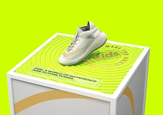
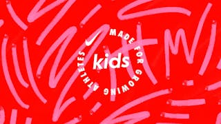
Nike asked us to help them design a new identity system and visual approach for their Young Athletes Category to reflect their newly evolved brand platform and communication strategy. Our goal was to create a visual system that reflects, inspires and sparks greater connection with one of Nike’s most dedicated, connected and expressive athletes.
Brand Identity, Brand Strategy, Art Direction

Kids takeover
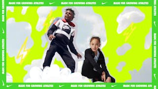
Our approach was inspired by a young athlete's sense of fearlessness. We love how kids don’t separate creativity and sport, but rather see athletic and artistic expression to be one in the same.
We began to wonder what it would look like if instead of designing a category identity that fit nicely into Nike’s existing brand we were to use Nike’s brand as the building blocks to reflect a new Nike identity built by kids.


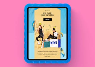
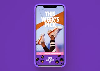

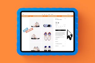
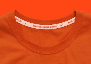
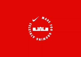
We created a system of graphic devices we used to adapt any Nike program to their younger audience. The “Made For Growing Athletes” marks, along with our visual system of collaged elements and graphic ‘stickers’ were used to communicate product specific benefits to kids and parents to help them see how the products they’re buying were designed and developed specifically with growing bodies in mind.
Integration
The category marks were designed to act as a qualifiers more than a independent category logos. Because kids product exists in almost every category within Nike, the Kids identity needed to not only stand on its own, but integrate into any existing product category that had offerings made specifically for kids.
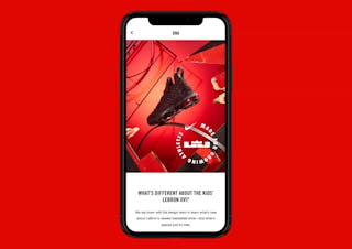
The work we were able to create with Nike is helping set a new mood and sense of play and authorship for Nike's next generation of Athletes.
It's also gives the category a scalable identity system that can seamlessly integrate with larger Nike categories.
